My Muscle Chef
Rebuilding the checkout experience
3 min read
- Role
- First UX/UI Designer at My Muscle Chef
- Tools
- Sketch, Sketch Cloud, Google Analytics
- Users
- Guests and existing customers ordering prepared meals online
- Year
- 2018
Overview
As My Muscle Chef's first UX/UI Designer, I fixed a checkout that was losing sales on mobile, then rebuilt the whole purchase journey around research with real customers.
My Muscle Chef delivers high-quality, great-tasting prepared meals built around health and fitness goals. I joined in September 2018 to improve the website experience for both guests and existing customers.
Impact
- Quick fixes to the live checkout, shipped with the CTO before the redesign
- A new checkout journey built on customer research and prototype testing
- Sketch Cloud introduced so the team could review and comment on designs directly
Challenge
Of all the projects I worked on, the most important was the checkout. The Chief Technical Officer flagged that sales were dropping off in the checkout, particularly on mobile. The job was to stop the losses quickly, then design a purchasing experience that converted.
With most customers ordering on their phones, I designed the new journey mobile first, then scaled it up for larger screens.
Researching the problem space
I worked in two stages:
- Find the quick wins. I tested the payment funnel myself and analysed Google Analytics real-time data, watching how real customers moved through checkout. That surfaced the immediate pain points, which I fixed with the Chief Technical Officer straight away. The quickest win was an incorrect link in the checkout, which I pinpointed as the likely cause of the drop-off.
- Understand the wider journey. With the quick fix in place, I ran a thorough UX review of the whole checkout funnel. I wrote research questions for the Customer Success Manager, who knew customers' gripes first-hand, and interviewed them to learn what existing customers were saying: their behaviours, preferences and pain points, and where the shopping experience was letting them down. That feedback went directly into the design.
Design & Prototype
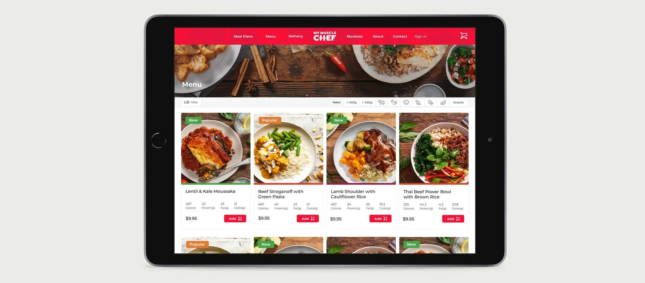
The redesign kept My Muscle Chef's bold red and black identity, set in Montserrat, and carried it consistently from the homepage through the menu to checkout.
The Solution
A three-step member checkout: delivery details, review your order, then payment. Each step does one job, with progress always visible, so customers can finish quickly on any device.
Mobile checkout
Delivery and meal plans
Project Reflection
Outcome
User research, iterative design, prototype testing and close collaboration with My Muscle Chef's stakeholders produced a new checkout journey: fewer steps, less friction and clearer, more persuasive language, designed to lift conversion. Sharing designs through Sketch Cloud also changed how the team worked, giving everyone instant access to the latest designs and one place to comment.
What I learned
A successful checkout is a careful balance of simplicity, trust and efficiency. Fixing the obvious problems first bought the time to redesign properly.
The site has since been superseded; the current version is at mymusclechef.com (opens in a new tab).
Have a project in mind?
Let's discuss how my design system, accessibility and product strategy skills can help your team.