My1Health
Redesigning Digital Health Infrastructure for Medical Tourism
7 min read
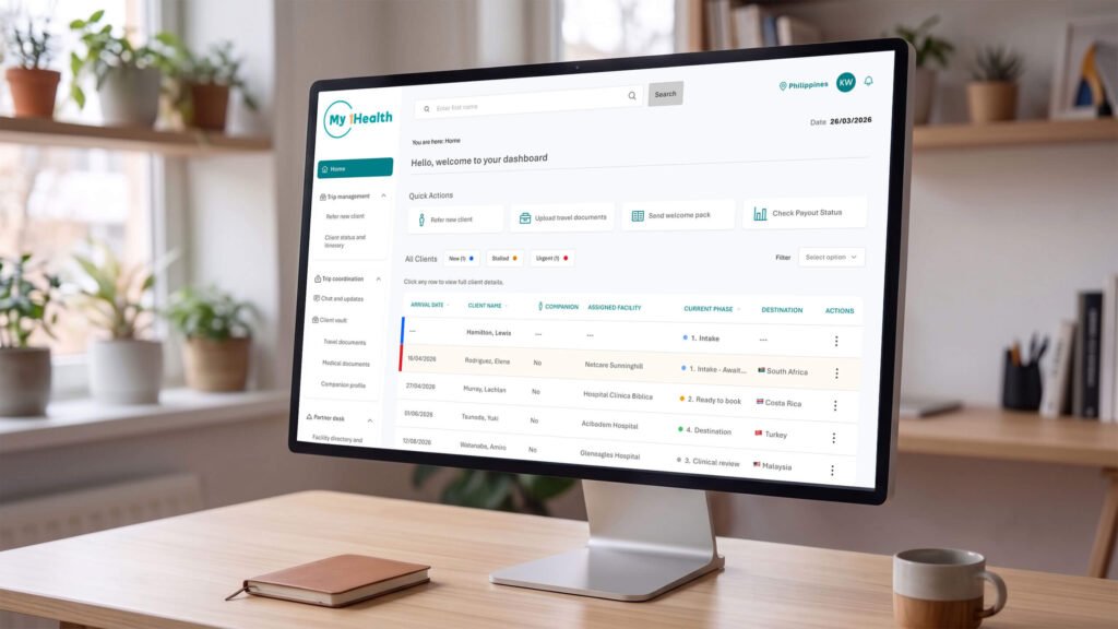
- Role
- Product Designer & UX/UI Specialist: strategy, interaction design, accessibility audit, prototyping and testing
- Tools
- Figma, Gemini AI, ChatGPT, Lyssna, WebAIM contrast checker
- Users
- Medical Tourism Officers, country managers, clients, and overseas partner hospital desks
- Timeline
- 9 weeks
Overview
I redesigned the client intake flow and officer dashboard for a medical tourism platform where 70% of potential patients dropped out during signup and document collection. I also audited the platform against WCAG 2.2 AA and built accessibility fixes into the design.
My1Health connects patients travelling abroad for medical treatment with partner hospitals overseas. In the platform, and in this case study, they're called clients.
The internal tool, Referral Partner Network System (RPNS), that managed this process relied on manual typing and put every case through identical steps. Medical Tourism Officers (MTOs), who each manage 2 to 5 cases a month, worked in dense, error-prone screens.
Impact
- 6 features added straight to the product roadmap
- 78% projected cut in manual data entry from the Secure Vault Bridge, driven by optical character recognition (OCR)
- 3.3:1 → 7.23:1 brand teal contrast lifted from failing to WCAG AAA, with a 48px minimum for tap targets
Challenge
The client intake flow was slow and manual. Officers typed every detail by hand from emailed documents, medical records came in late and left referrals stalled, and there was no fast way to find the right partner hospital for each client. The brief was to redesign the flow so the right information arrives earlier, takes less effort to capture, and leads officers to the right hospital sooner.
The design had to serve two audiences with different needs. International clients need low-effort, reassuring steps. Officers need speed at volume.
How might we give officers the speed they need at volume, while making each step feel simple and reassuring for international clients?
Objective
- Cut the manual data entry officers do for every referral.
- Get medical documents in and checked early, so fewer referrals stall.
- Help officers find the right partner hospital for each client, fast.
- Keep every step simple, reassuring and accessible for international clients.
Researching the problem space
To understand where intake broke down, I combined four sources: the CEO's view of the business, an expert review of the existing platform, usage data, and testing with real users. Together they pointed to the same pressure point: document collection, where 70% of referrals dropped off, and the gap between the secure system and the WhatsApp conversations partners actually rely on.
Methods used
- CEO interview: a semi-structured, recorded session with founder and CEO Ryan Marincowitz.
- Heuristic evaluation and WCAG 2.2 AA audit: a structured usability and accessibility review of the existing platform.
- Analytics review: traffic and drop-off data, plus a WebAIM contrast check of the brand colours.
- Usability testing: one remote test on Lyssna with 13 recruited participants, using a wireframe prototype, before moving to high-fidelity design.
Five friction points from the CEO interview
- Missing or outdated patient records.
- A 70% drop-off during document collection.
- Passport and medical record names that don't match, which cause travel delays.
- Visa deposits that create major barriers for clients in some destinations.
- Referral partners with varying technical confidence, many of whom prefer WhatsApp to the system.
The WhatsApp preference shaped the design. The solution had to link the secure system to the messaging channels people already use.
The full heuristic evaluation and WCAG 2.2 AA audit are in the Appendix.
Building user empathy
Four groups depend on the referral system, each with different stakes, from officers handling 2 to 5 cases a month to overseas hospital teams reviewing patient files. Walking through the legacy journey from their side showed why clients dropped out: every document was requested in one go, at the very end, after the officer had already built the profile by hand.
Four groups rely on the system
- Medical Tourism Officers (MTOs): manage 2 to 5 cases a month.
- Country managers: monitor bookings and travel-corridor trends.
- Clients: patients moving through the referral journey.
- Partner desks: overseas hospital teams reviewing patient files.
How the legacy journey worked
Document collection sat at the end of the process. An officer built a profile by hand, then asked the client for passport and medical scans in one large request. That's the point where clients dropped out.
That pointed to one direction: capture the hardest data first (identity and documents) using automation, then let the system handle routing and prioritisation.
Read the persona as text
Read the journey map as text
Design & Prototype
The research set four principles, which guided every design decision. Ideas started as notebook sketches, became quick wireframes and a mapped referral flow, and then a wireframe prototype was tested with 13 participants on Lyssna.
Four design principles
- Streamline: Cut visual clutter, use plain-language labels, increase tap targets to a 48px minimum.
- Localise: Auto-match clients to hospitals using travel corridors, proximity and visa timelines.
- Automate: Move OCR document capture to the start of the flow to remove manual entry immediately.
- Customise: Route routine and urgent cases through different, prioritised workflows.
Start on paper
Wireframe, then test
The wireframe prototype tested on Lyssna, screen by screen: one referral, from an empty dashboard to a submitted booking.
Test & Iterate
What testing showed
In a remote test on Lyssna, 13 participants used the wireframe prototype to refer a new client and complete the client's details. Five completed the task without difficulty; the main friction came before people reached the form.
The biggest issues:
- Starting a referral: six participants couldn't find or start a new referral.
- New versus existing clients: pre-populated data looked like an incomplete referral, so the correct starting point was unclear.
- Visual hierarchy: required fields weren't clearly distinguished from optional ones.
What was changed:
- Kept the main navigation permanently visible rather than collapsible.
- Made New Referral a clear, persistent primary action.
- Created a distinct empty state for new referrals.
- Strengthened required-field indicators so mandatory information is clear upfront.
The Solution
A guided four-step intake flow: client details, medical documents, service type and location, and review and submit. Each step removes a task that officers used to do by hand, or moves it to the client through a channel they already use.
Step three runs on the RPNS location-matching engine, which ranks best-fit partner hospitals for each client. I conceptualised the engine as well as designing its interface.
Step 1: Client details
Step 2: Medical documents
Step 3: Service type and location
Step 4: Review and submit
Dashboard
The officer's journey, redesigned
Walking the same Medical Tourism Officer through the new flow shows what changed. In the legacy journey, her confidence fell with every step and hit its lowest point at documents, the step where 70% of patients dropped off. Now documents come first, details fill themselves in, and the dashboard tells her where each case stands, so her confidence rises instead.
Read the improved journey as text
Project Reflection
In nine weeks, the project moved My1Health's intake from manual typing and stalled documents towards a guided flow that collects documents first and matches each client to the right hospital. The redesign earned a place on the product roadmap, and showed me how much the logic behind the screens shapes how well they work.
Outcome
Ryan Marincowitz reviewed the work and put six features directly onto My1Health's product roadmap:
- The RPNS location-matching logic
- Predictive stall-state alerts
- The OCR-driven Secure Vault Bridge
- 'Fetch My Client' functionality
- Three-path personalisation (generalist, urgent and concierge)
- An accessibility audit baseline
He described the RPNS matching logic as the most ambitious conceptual design thinking he had seen.
What I learned
Mapping the backend logic alongside the interface mattered most. A well-designed form doesn't help if the routing rules behind it are flawed. Designing the RPNS matching rules and OCR triggers in tandem with the screens meant the tool changed how work gets routed, not just how it looks.
Presenting the work taught me a second lesson. Ryan's feedback was that setting out the WCAG AA and AAA recommendations first, before building them into the high-fidelity designs, was a more effective way to show the accessibility concerns: stakeholders could see each issue, and the options for fixing it, before any design was committed.
Reference
Appendix
Supporting detail for the case study above, in the order the work happened: the research documents, the legacy journey, the audit, the logic behind the screens, sketches, each intake step in depth, and the accessibility work.
Research documents
The documents behind the research: the team's interview plan, the founder interview itself, and the follow-up questions it raised. They have been edited for publication: names of the student team, mentor and staff, and some of the client's commercial details, are removed.
Stakeholder interview questions
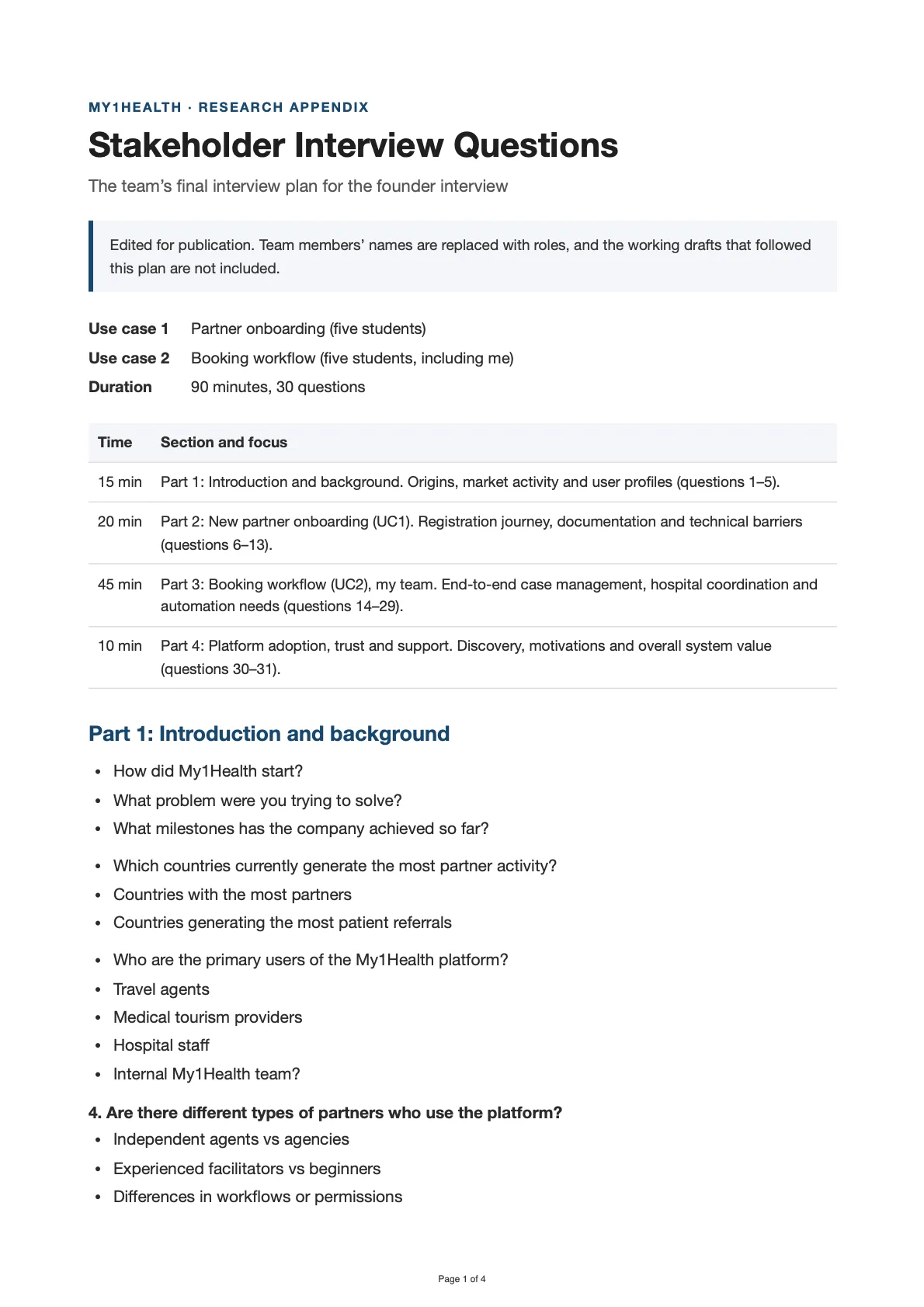
The team's final plan for the 90-minute founder interview, including the booking workflow questions I asked.
Page 1 of 4
Stakeholder Interview Questions
Title page: the two use cases, the 90-minute plan by section, and Part 1: Introduction and background.
Read the text version
Stakeholder interview transcript
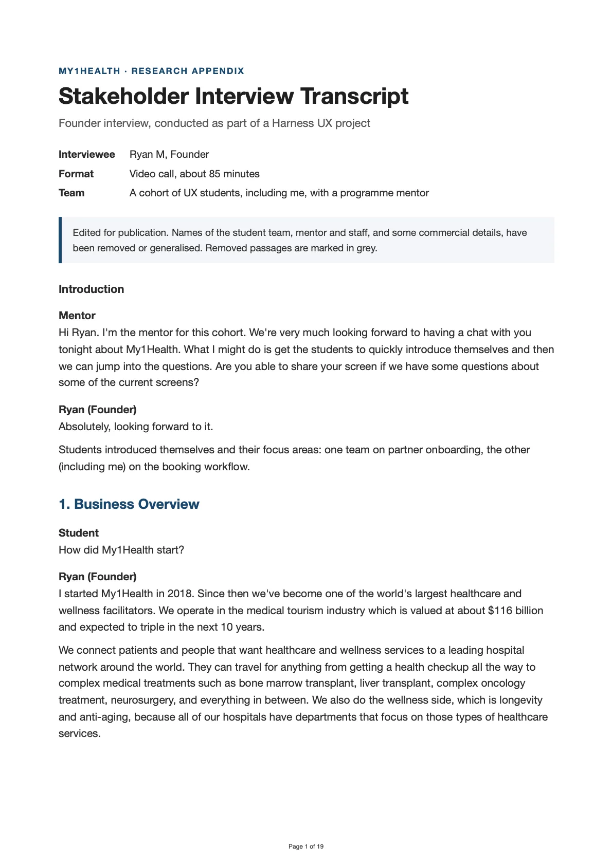
The founder interview, from the business overview to the bottlenecks in the booking workflow.
Page 1 of 19
Stakeholder Interview Transcript
Title page, then 1. Business Overview.
Read the text version
Follow-up questions and requests
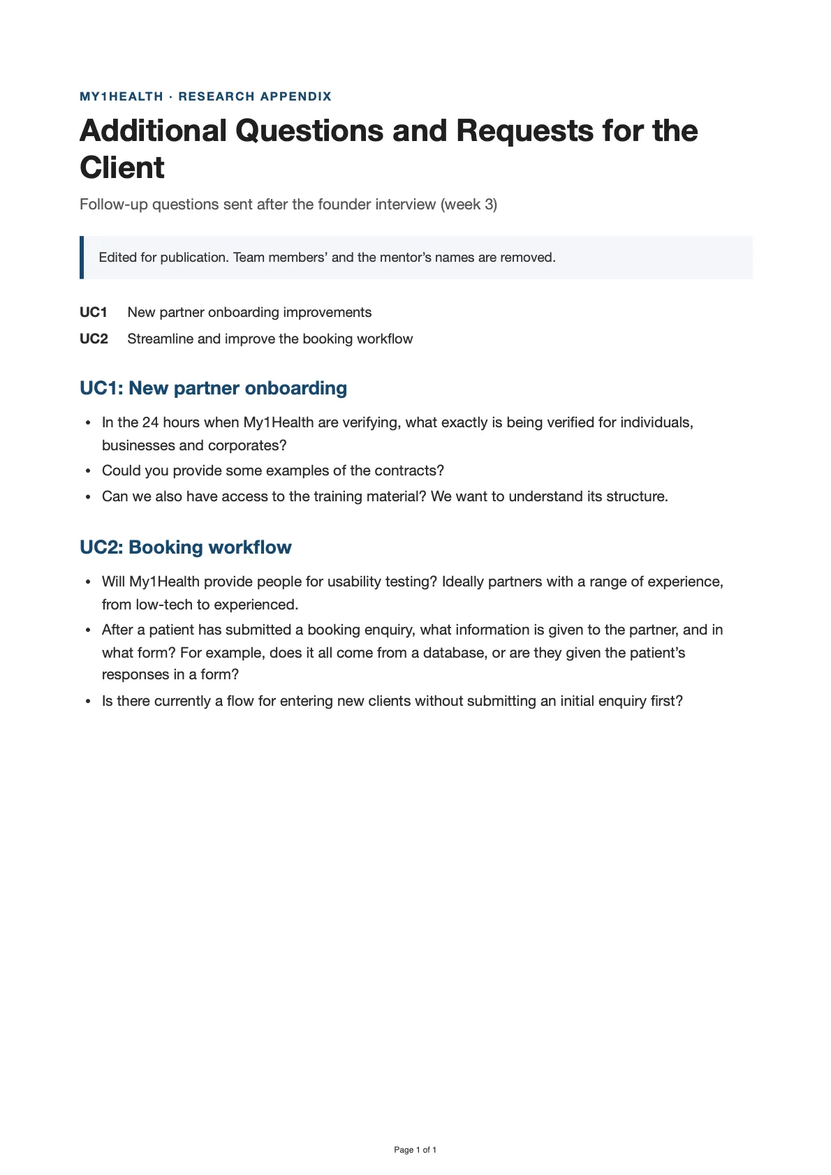
The follow-up questions sent to the client after the interview.
Page 1 of 1
Additional Questions and Requests for the Client
Title page, then UC1: New partner onboarding; UC2: Booking workflow.
Read the text version
The legacy journey
Every case followed the same steps, whether it was a routine wellness check or an urgent procedure. Officers had no fast way to find the right partner hospital, and no way to see which clients had stalled on uploading documents.
The legacy booking flow, screen by screen:
Heuristic evaluation and WCAG 2.2 AA audit
Evaluated the existing platform against Nielsen's ten heuristics and audited it against WCAG 2.2 AA, drawing on the CEO interview and stakeholder feedback. The audit was a desk review.
Four heuristics rated High severity: visibility of system status, user control and freedom, error prevention, and recognition rather than recall. Three themes ran through the findings:
- The notification gap. Partners have no automated updates, so they must remember to log in and check.
- Reliance on human intervention. The system doesn't prevent errors such as old records or mismatched names, so the My1Health team coordinates fixes by hand.
- The WhatsApp preference. Partners prefer WhatsApp to the system, which signals a weak match with the real world and with how partners want to work.
| Criterion | Status | Observation |
|---|---|---|
| 1.4.3 Contrast (Minimum) | Risk, then confirmed | Stakeholders described the original design as text-heavy. A WebAIM check confirmed white text on the brand teal (#009DA4) reaches 3.3:1. That passes AA for large text (3:1) but fails AA for normal text (4.5:1). |
| 2.1.1 Keyboard | Likely violation | Complex inquiry and booking workflows with many fields tend to fail if they can't be completed with the Tab key alone. |
| 2.4.11 Focus Not Obscured (Minimum), new in 2.2 | Risk | Sticky headers or the Cena AI chat bubble might cover input fields while tabbing through the booking form. |
| 2.5.8 Target Size (Minimum), new in 2.2 | Risk | Many partners use mobile devices while walking around a hospital. Small, cramped buttons lead to mis-taps. |
| 3.3.3 Error Suggestion | Violation | Errors turn into back-and-forth on WhatsApp because the system doesn't explain what's wrong, e.g. a record older than 6 months. |
| 4.1.3 Status Messages | Major violation | Partners are out of the loop on status changes unless they log in. |
Heuristic evaluation of the existing platform
All ten heuristics, with what I found and what I recommended.
| Heuristic | What I found | Recommendation | Severity |
|---|---|---|---|
| 1. Visibility of system status | Partners must log in to track case status. No automated email or WhatsApp notifications for status changes. | Integrate the Cena AI agent to push real-time status alerts (e.g. “Treatment Plan Received”) by WhatsApp or email. | High |
| 2. Match between system and real world | Mixed. Standard medical tourism terms are used, but partners feel most comfortable on WhatsApp, and the workflow doesn't yet feel as natural as a chat. | Move to a conversational, concierge-style onboarding that mirrors the human coordination partners rely on. | Medium |
| 3. User control and freedom | Partners can't revise submitted information themselves. The My1Health team fixes it manually, with no clear edit function. | A self-service revision portal to add missing documents or edit pending cases. | High |
| 4. Consistency and standards | Onboarding varies between individuals and corporates with no unified design system. | Modular onboarding paths by partner type, e.g. travel agent and medical facilitator. | Medium |
| 5. Error prevention | The system accepts incomplete inquiries and medical records older than 6 months, which hospitals then reject. | Use OCR to auto-fill identity details from passports and add constraints, e.g. a date picker that blocks outdated files. | High |
| 6. Recognition rather than recall | Partners must remember hospital requirements (e.g. the 6-month oncology rule) because there's no context-sensitive checklist during upload. | Dynamic checklists that change with treatment type or destination country. | High |
| 7. Flexibility and efficiency of use | No shortcuts exist for agencies managing bulk cases. | Bulk uploading for agencies and AI summarisation of medical records. | Medium |
| 8. Aesthetic and minimalist design | Opportunity. Stakeholders described earlier versions as text-heavy and overwhelming. | A card-based, minimalist design that separates simple bookings from complex treatment plans. | Low |
| 9. Help users with errors | Missing information is handled through back-and-forth on WhatsApp instead of clear diagnostic error messages. | Specific error prompts (e.g. “The name on this passport does not match the form”) with steps to fix the issue. | Medium |
| 10. Help and documentation | Mixed. Basic tutorials and a certification programme exist, but need to be better integrated into the workflow. | Embedded help bubbles and a searchable FAQ focused on common showstoppers (visa requirements, medical record access). | Low |
RPNS priority action plan
| Priority | Heuristic | Proposed change | Goal |
|---|---|---|---|
| Critical | Error prevention | OCR passport and document scanner | Extract client data from passports automatically to prevent mismatched names and typos. |
| Critical | Visibility of system status | Automated status labels and Cena AI integration | Push real-time status updates to partners by WhatsApp. |
| High | Recognition rather than recall | Interactive client checklists | Show partners and clients specific requirements (e.g. the 6-month medical record rule). |
| High | Flexibility and efficiency | AI medical record summariser | Cut the time coordinators and partners spend reviewing uploaded records. |
| Medium | Consistency and standards | Modular onboarding modules | Tailor onboarding to partner type to increase activation. |
| Medium | User control and freedom | Self-service edit and revision portal | Let partners update or add documents to a pending case without the internal team. |
Map the logic before the screens
The redesign relied on automation, so the interface was only half the work. The referral journey was mapped in three stages: document upload with OCR checks, automatic hospital matching, and review and submission.
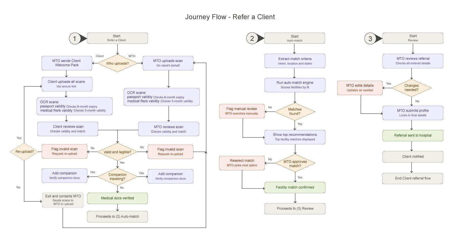
Journey flow for referring a client.
Then the 'Intake and Profile Creation' triggers were detailed: exact rules for OCR scanning (e.g. checking a passport has at least 6 months validity remaining, flagging name mismatches between documents and the client profile), branching paths for companion logistics, and automated re-send triggers for intake messages.
1. Start and the automated intake request
2. Identity verification
3. Medical documents
4. Companion logistics
5. The automated intake message
6. Intake form fields and OCR auto-fill
The form is divided into logic blocks that match the Trip Management pillars.
| Section | Mandatory details | OCR logic (auto-fill) |
|---|---|---|
| Personal info | Full name, date of birth, gender, nationality | Scanned from the passport's machine-readable zone (MRZ) |
| Identity | Passport number, issue date, expiry date | Flags instantly if under 6 months' validity remains |
| Medical intent | Trip category (e.g. dental), primary complaint | Extracted from the medical documents' header or summary |
| Contact | Email, phone (WhatsApp preferred), home city | Extracted from the initial enquiry or referral form |
| Companion | Yes / no toggle | If yes, opens the companion profile sub-form |
Read the logic flow as text
Sketches and wireframes
Began with hand-drawn sketches in a notebook. They worked out the four-step progress bar (of the intake form itself) and the Quick Actions row on the dashboard, and allowed iterating on layout without getting bogged down in pixels.
I then turned the sketches into wireframes, and built a prototype from them for user testing on Lyssna.
The redesign
The ideal intake flow
The redesign turns the legacy flow around. Instead of typing a profile by hand and asking for documents last, officers find or import the client first, collect and check documents early, get ranked hospital matches automatically, and review everything on one error-safe screen. Each step answers a pain point in the legacy flow above.
Step 1: Client details
- Starts by finding or importing the person, not typing them in
- Three tabs auto-populate the form: Search for client, Fetch my client and Import client passport
- Fetch and Import form the OCR-driven Secure Vault Bridge
- Required fields carry a red asterisk, and optional fields say so in the label
Before: officers entered every detail by hand, reading off emailed PDFs and typing into dense forms.
Step 2: Medical documents
- Officers send the client a secure upload link by SMS, with an editable message, or upload the files themselves, because many partners prefer WhatsApp
- Either path triggers OCR extraction, with a real-time accuracy score
- An SMS preview shows the message before it goes out, so officers stay in control of what the client receives
Step 3: Service type and location
- Officers choose the service, set urgency, and say whether the client is travelling with a companion
- Routine care (4 to 12 weeks) and urgent care (within 2 weeks) follow different paths
- Urgent referrals are flagged as priority, with a fast-tracked hospital review within 24 to 48 hours
- The RPNS location-matching engine ranks best-fit partner hospitals as soon as the client's home and treatment countries are entered, based on proximity, visa corridor and flight-safety timing
Step 4: Review and submit
- Error-safe: client details, clinical documents and service details each have their own Edit button, so a mistake is fixed without restarting the form
- A verification switch confirms the traveller's passport is valid for at least 6 months
- The screen logs when the SMS request was sent
A dashboard built around clients
On the dashboard, Quick Actions replace the crowded card layout, and one client table shows arrival date, companion status, assigned facility, current phase and destination. Colour bars on the left edge and New, Stalled and Urgent filters let officers gauge pipeline urgency at a glance. Phase names appear as text alongside the colour dots.
To stop clients dropping off silently, testing led to a predictive 48-hour stall alert that resurfaces stuck cases before they go cold, and an Urgent Logistics panel for trips inside a critical 48-hour window.
Accessibility decisions
The audit gave a clear starting point. The design changes below address what it found, and they're one part of a baseline that can be extended, not a claim of full WCAG conformance.
- Colour contrast. White text on the original teal reached 3.3:1. Teal AA (#007E85) and Teal AAA (#006166) were added to the brand palette. The original teal stays for large text and decoration.
- Tap targets. 48px minimum, above the 24px minimum in WCAG 2.2 AA (2.5.8), for officers and partners working on phones in busy environments.
- Plain language. Jargon replaced with plain labels for non-native English speakers.
- Status you can read. Phase names, statuses and required fields use text as well as colour.
- 3.3:1Original teal #009DA4Fails AA for normal text (needs 4.5:1). Passes AA for large text (needs 3:1).
- 4.85:1Teal AA #007E85Passes AA for normal text. Passes AAA for large text.
- 7.23:1Teal AAA #006166Passes AAA for normal text (needs 7:1).
WebAIM contrast checks
How the redesign responded to the audit
The audit covered more than the intake flow, so some recommendations remain open.
| Heuristic | Severity | Design response | Still open |
|---|---|---|---|
| Error prevention | High | OCR reads passports and medical files at the start, checks passport validity and name matches, flags invalid scans for re-upload. | Blocking outdated records in the upload control for every partner type. |
| Visibility of system status | High | A current-phase column, New/Stalled/Urgent filters, a 48-hour stall alert, and a logged confirmation when an SMS request is sent. | Pushing real-time status updates to partners by WhatsApp/email through the Cena AI agent. |
| User control and freedom | High | Independently editable blocks on the review screen. | A self-service revision portal for partners to edit pending cases. |
| Recognition rather than recall | High | The automated intake message lists what the client needs to upload; the review screen states the passport rule. | Dynamic checklists that change by treatment type and destination country. |
| Match between system and real world | Medium | A secure SMS upload link meets clients in the messaging channel they already use. | A conversational, concierge-style onboarding. |
| Flexibility and efficiency of use | Medium | Fetch my client, Import client passport, and a choice of SMS or manual upload. | Bulk upload for agencies and AI summarisation of medical records. |
| Aesthetic and minimalist design | Low | A decluttered dashboard with Quick Actions and a single client list. | None noted. |
Impact and testing detail
- CEO review: Founder and CEO Ryan Marincowitz described the RPNS matching logic as the most ambitious conceptual design thinking he had seen.
- User testing: A Lyssna test of the wireframe prototype with 13 participants showed the main friction came before the form, at finding and starting a referral. Navigation, primary action, empty state and required-field cues were changed in response.
- Prototype defects: required fields couldn't be completed and some buttons needed multiple clicks.
Other testing observations: The test also covered navigation discoverability and the new OCR and SMS features. Participants understood the difference between sending an SMS request and uploading documents manually. Findings shaped the high-fidelity design.
Limits and next steps
The 78% figure is a projection for a feature that hasn't shipped, not a measured result.
- Testing was a single Lyssna test of a wireframe prototype with 13 participants, so the results show the design direction and not live-product performance.
- The 78% reduction in manual entry is a projection until the OCR feature ships and can be measured.
- The accessibility audit was a desk review. Testing with assistive technology and with people who have disability is the next step.
- The open recommendations in the table above are candidates for the next design phase.
Have a project in mind?
Let's discuss how my design system, accessibility and product strategy skills can help your team.