Kwenta Futures
A futures trading dashboard for a global design challenge
3 min read
- Role
- UX/UI Designer, solo challenge entry
- Challenge
- Synthetix Global UX/UI Designer Challenge
- Year
- 2021
Overview
I designed a dashboard for Kwenta's new Futures product, as my entry to the Synthetix global UX/UI designer challenge. The entry placed in the top 10.
Synthetix was moving to Layer 2 and launching synthetic futures on Kwenta, its trading dApp. Futures let traders gain exposure to an asset, long or short, without holding it, with margin held in a stablecoin (sUSD). Synthetix ran the challenge to find two full-time UX/UI designers.
Impact
- Top 10 finalist in a global designer challenge
- Every feature in the brief covered on a single dashboard
- Deposit and new-order flows designed beyond the brief's scope
Challenge
The brief asked for one dashboard, in Kwenta's existing dark style, that lets traders learn about futures and their risks, compare every market, see their sUSD balance against the margin they've deployed, track open positions, review past performance, and refer a friend.
That's a lot of dense financial data for one screen, for an audience ranging from first-time futures traders to experienced ones. The challenge was to make it scannable without hiding the risks.
The Approach
I started with a wireframe to settle the information architecture: a fixed sidebar for the four areas of the product, and the page itself ordered from learning to doing.
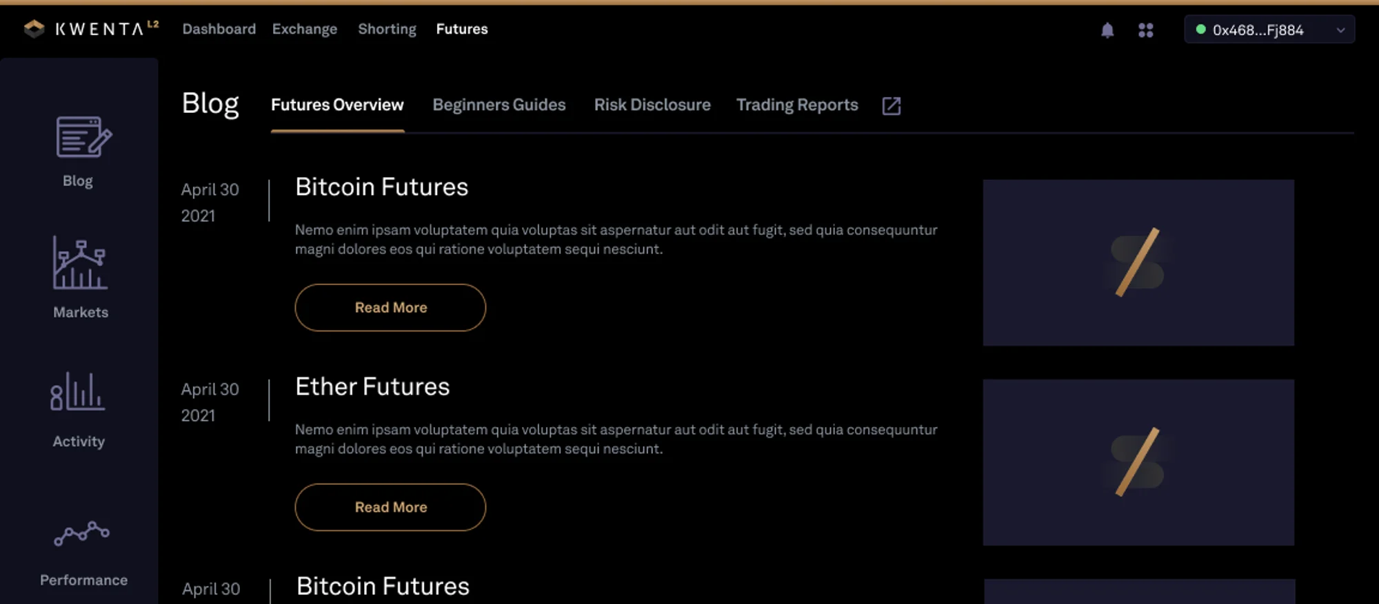
- Learn: a blog with tabs for a futures overview, beginners' guides, a risk disclosure and trading reports.
- Browse: markets, with a personal watchlist above trending assets.
- Check: wallet activity, comparing margin deployed with the sUSD still available.
- Act: open positions, with a price chart above them.
Two things changed between the wireframe and the final design. The sidebar's “Summary” became “Performance”, to match the brief's language, and the refer-a-friend panel moved from the foot of the sidebar into a full card beside the markets, where it would actually be seen.
Design
The final design keeps Kwenta's dark style and gold accents. Gains and losses use green and red, so traders can read a table at a glance, and every figure in a column lines up for easy comparison.
Answering the brief
- Learn about futures and their risks: the blog, with a dedicated Risk Disclosure tab.
- View every market: asset, price, 24-hour change and 24-hour funding change, with a watchlist for the assets a trader follows.
- sUSD balance against margin deployed: a bar chart for each asset, a margin score, and a wallet breakdown with deposit, withdraw and exchange actions.
- Open positions: a positions table with liquidation price and margin ratio, so the risk of each trade is always in view.
- Past performance: margin history and order, trade and transaction history tabs.
- Refer a friend: the Earn SNX card.
Beyond the brief: depositing and opening a position
The brief didn't ask for trading screens, but the user flow starts with funding a margin account and opening a position, so I designed both as modals over the dashboard.

Project Reflection
Outcome
The dashboard placed in the top 10 of the Synthetix Global UX/UI Designer Challenge, and was rewarded with 200 SNX. Synthetix announced the finalists on its blog in July 2021.
Read the challenge results on the Synthetix blog (opens in a new tab)
What I learned
- Order the page the way people think. Arranging the dashboard from learning to acting gave a dense screen a clear story, for new and experienced traders alike.
- Keep risk in view. In trading, liquidation price and margin ratio matter as much as profit, so they sit in the main table, not behind a click.
Have a project in mind?
Let's discuss how my design system, accessibility and product strategy skills can help your team.