ketch-Up
Crafting a Warmer, Safer Path to Adult Friendships
7 min read
- Role
- UX + UI Design, User Research, Information Architecture, Interaction Design, Prototyping & Usability Testing
- Tools
- Lyssna, FigJam, Figma
- Users
- Women seeking real, in-person friendships through small group meetups
- Timeline
- 9 weeks
Overview
I redesigned the homepage, meetup pages and checkout for a women-only friendship platform where most first-time visitors browsed without registering. I traced the drop-off to gaps in clarity and trust, and validated the redesign with 23 participants in an unmoderated usability test.
ketch-Up is a community platform helping women build real, lasting friendships through small, intentional in-person meetups. Interest was strong; registrations weren't.
Impact
- 23 participants in the unmoderated usability test that validated the redesign
- A checkout bug traced to Figma's prototype viewer, not the design, and worked around for testing
- Testers reported feeling significantly safer and more informed after the redesign
Challenge
Direct user interviews revealed that when women arrive at ketch-Up, they're quietly asking two questions: “Is this real?” and “Will I feel safe here?” If the site doesn't answer both fast, they leave.
Research surfaced two core problems: a lack of clarity about what ketch-Up is and who it's for, and friction on meetup pages that left women without enough confidence or detail to convert interest into attendance. The redesign had one goal: turn passive curiosity into confident registration.
How might we help women feel sure ketch-Up is real and safe, quickly enough to book their first meetup?
Objective
- Make it clear within seconds what ketch-Up is and who it's for.
- Build trust and a sense of safety before anyone commits to a meetup.
- Give meetup pages the detail women need to register with confidence.
Researching the problem space
To ground the redesign in evidence rather than assumption, I ran:
- Participant interviews: semi-structured sessions covering past event behaviour, introvert/extrovert dynamics, and what builds or breaks trust on a website
- Heuristic evaluation: a structured usability audit of the existing site
- Competitor analysis: a comparison matrix across four direct alternatives on utility, pricing, tone, and entry friction
- Analytics review: traffic and drop-off data, plus a WebAIM contrast check
Competitive analysis
To see what women could already find elsewhere, I reviewed four direct alternatives to ketch-Up: Plannerettes Inner Circle, Clayground, Side By Side and After5.
The matrix rates those four businesses, not ketch-Up itself. Each sticky note is something one of them offers or lacks, sorted into four tiers by how it measures up to what members expect:
- Unique: innovative; it sets the expectations others follow
- Good: goes beyond what members expect
- Basic: meets expectations; the minimum members take for granted
- Poor: doesn't meet expectations
Unique: sets expectations
- Plannerettes Inner Circle: a non-judgemental, online-only community of women, open globally and still growing; weekly live online sessions, regular workshops and email newsletters; members share their wins and struggles, and know the value of belonging
- Clayground: a shared art community space with long opening hours; casual or regular membership, member discounts and private events; renewable energy powers its studios, and a new studio is opening on the northern beaches
- Side By Side: well-being classes
- After5: a wide range of activities, in multiple countries and cities
Good: goes beyond expectations
- Plannerettes Inner Circle: a strong sense of community support across the globe; members gain new skills, routines and encouragement; members can give input and feedback; early-bird offers on monthly subscriptions
- Clayground: clean, well-organised events and timetabling; part of its profits go to charities protecting the natural world
Nothing noted for Side By Side or After5.
Basic: meets expectations
- Plannerettes Inner Circle: works on desktop and mobile; members can plan around their own schedule
Nothing noted for Clayground, Side By Side or After5.
Poor: falls short
- Plannerettes Inner Circle: no trial period; no preview of the paid community for non-members; interested people join a waitlist for the next opening
- Clayground: quite expensive
Nothing noted for Side By Side or After5.
What I found
Six findings, each with the research method it came from.
The “vibe” gap
Interviews
Women wanted to know who'd be there and what the atmosphere was like before committing
Buried details
Heuristic evaluation
Practical logistics were hard to find, adding decision fatigue
The trust gap
Interviews + competitor analysis
Visitors needed concrete legitimacy signals: real photos, host profiles, reviews
Accessibility risk
WebAIM audit
The homepage's coral-on-white text failed contrast at 1.83:1
Mobile drop-off
Analytics
Strong social-driven mobile traffic wasn't converting because the layout wasn't optimised for it
Market gap
Competitor analysis
Competitors leaned generic and transactional; nobody owned “small, guided, intentional meetups”
“Am I putting money towards buying a ticket? Am I going to be safe? What is the environment?”
Building user empathy
The same patterns kept surfacing in the interviews: women found ketch-Up through Facebook, worried at first that it might be a scam, couldn't tell what their ticket paid for, and felt most at ease in small groups. I brought them together in Rachel, a persona whose journey map traces that path from curiosity to her first booking.
Read the persona as text
Read the journey map as text
Design & Prototype
Make the value clear from the start
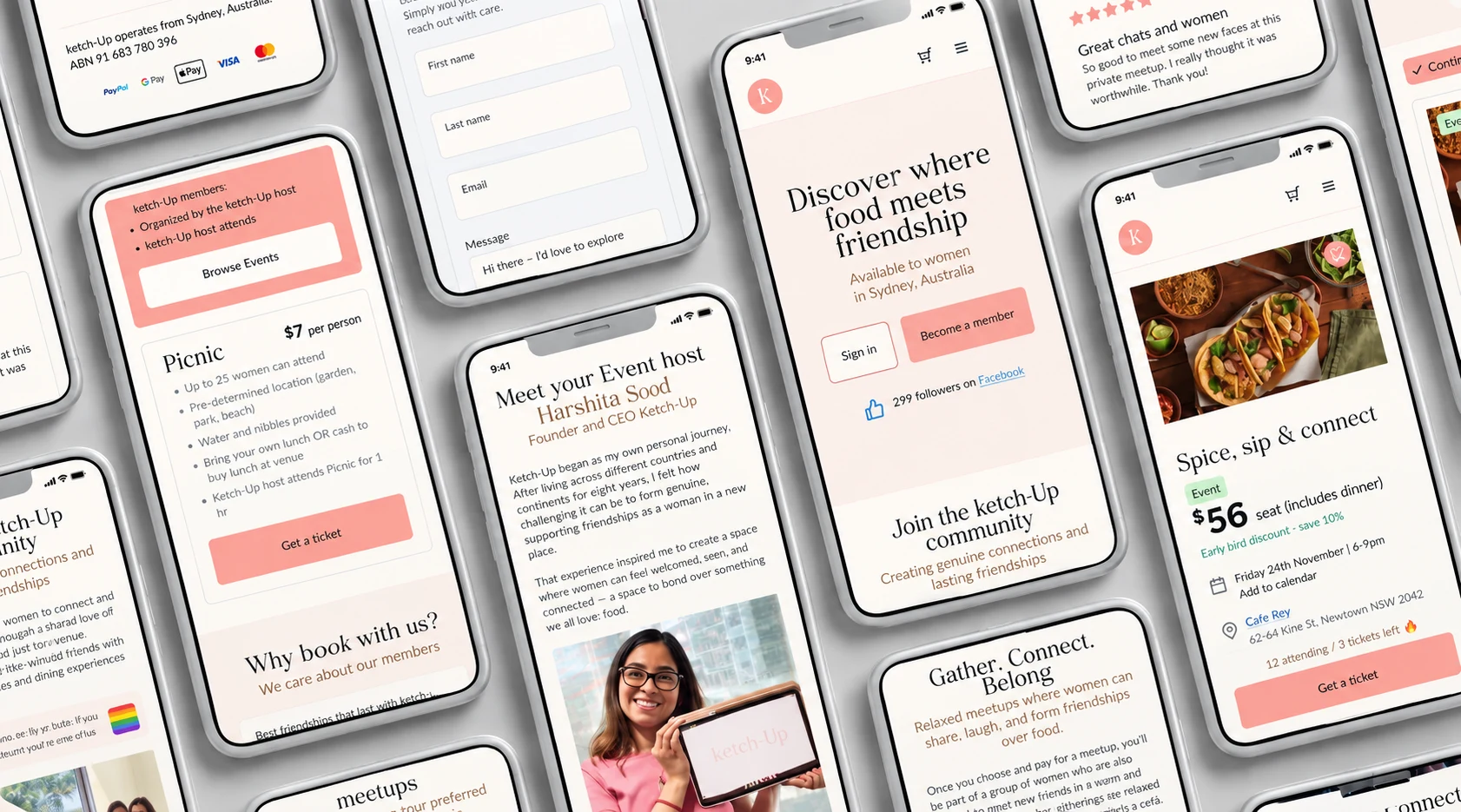
I rebuilt the homepage around real member stories and a clearer value proposition, so visitors understand what ketch-Up is, and why to join, within seconds.
Build trust into the experience
Rather than relying on trust badges alone, I built reassurance into the structure itself: real member reviews, transparent pricing, detailed host profiles, verification badges, ABN details and a clear cancellation policy.
Make meetups easier to understand
I redesigned meetup pages to answer what visitors need before committing: who's hosting, what to expect, how many places are left. Live seat tracking adds a sense of activity and confidence to book.
Remove friction on mobile
Mobile was a key source of drop-off, so I simplified the experience with a sticky CTA, fewer checkout fields, and pricing shown upfront rather than three steps in.
Test & Iterate
An unmoderated Lyssna study confirmed improvements in clarity and emotional reassurance, and surfaced a checkout bug in Figma's prototype viewer, which I worked around before the next round of testing.
View the full Lyssna test results (opens in a new tab)
What participants were asked to do
Working through a Figma prototype on mobile, participants rated each task from 1 (very hard) to 5 (very easy):
- Scan the homepage and say what ketch-Up is: 4.35 average
- Open and close the main navigation: 4.43
- Find the section on gathering types: 4.26
- Understand the types of gatherings: 4.22
- Go to the gatherings page from the menu: 4.26
- View the details of the first meetup: 4.09
- Add the meetup to the cart: 2.96
- Complete the checkout: 3.00
What testing showed
- The purpose was clear. 91% rated the homepage easy or very easy to understand, the clearest sign the new value proposition was working.
- Finding a meetup was easy. Navigation, gathering types and meetup details all averaged above 4 out of 5.
- Buying a ticket wasn't. Adding to the cart and checking out scored lowest, with 43% rating each hard or very hard. That pointed straight to the checkout bug.
- Most people went straight through. 18 participants took the direct path from the homepage; the 2 who opened the menu first spent over six times as long and misclicked more than half the time.
What changed
- The checkout bug wasn't a design fault: it came from the Figma prototype viewer itself. For the purposes of the user test, I changed the Add to cart button so it was no longer a sticky component, which let the cart and payment steps work end to end.
Lyssna usability test
Finding a meetup was easy. Paying for it wasn't.
- Participants
- 23
- Found the homepage easy to understand
- 91%
- Took the direct path from the homepage
- 18 of 23
- Rated checkout hard or very hard
- 43%
Average ease rating for each task, out of 5
The two lowest scores, adding to the cart and checking out, traced back to a bug in Figma's prototype viewer, not the design.
Meetup pages
Mobile checkout
Final presentation and script
The 12-minute presentation I gave at the end of the project. The note under each slide is what I said, from my presenter script.
Slide 1 of 19
Improving the ketch-Up homepage and meetup experience
Hi everyone, I’m Eleonor. Today I’m taking you through the UX process I used to improve the homepage and meetup pages for ketch-Up, a community built to help women form real, lasting friendships. This work is about more than just visuals. It’s about clarity, trust, and helping women feel emotionally comfortable taking that first step toward new connections.
Project Reflection
Outcome
Testing validated the trust-first approach: clearer positioning up front, and reassurance built into every meetup page.
What's next?
Beyond this redesign, I also scoped a low-cost way to validate demand for a future community chat feature before any engineering investment. I'm happy to walk through in conversation.
Project takeaways
- Trust is built before the booking page. Both women I interviewed (Rachel and Joanne) checked legitimacy (an ABN, a real person behind it, where the money goes) long before they thought about price. Designing for trust meant starting on the homepage, not the checkout.
- Check the tool before you blame the design. The two lowest test scores traced back to a bug in Figma's prototype viewer. Working around it rather than redesigning the checkout taught me to separate prototype limits from real usability problems.
- Small details carry big reassurance. A seat count, an ABN in the footer and a named host did more to make women feel safe than any copy telling them they would be.
Reference
Appendix
Lyssna usability test results
The full results of the unmoderated test: 23 participants working through the Figma prototype on mobile. They're also available on Lyssna (opens in a new tab).
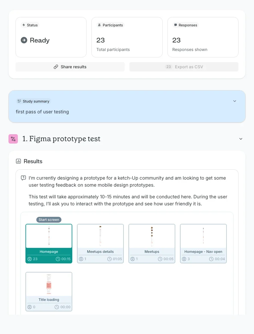
Page 1 of 6
Overview and task set-up
23 participants and 23 responses. A first pass of user testing on a Figma prototype of the mobile site, taking 10 to 15 minutes, starting on the homepage.
Read the results as text
Have a project in mind?
Let's discuss how my design system, accessibility and product strategy skills can help your team.