Healius
Intuitive Enterprise Healthcare
5 min read
- Role
- UX + UI Design, Visual Design, Design Systems Governance, Interaction Design, User Research, Prototyping & Clinical Evaluation
- Tools
- Figma, FigJam, Zoom
- Users
- Clinical operators across labs and diagnostics
Overview
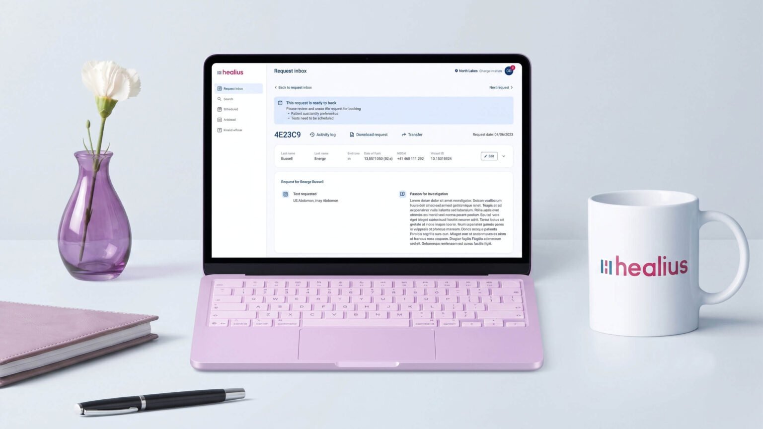
I led the redesign of the Request Management dashboard for one of Australia's leading healthcare providers, unifying six disjointed clinical brand workflows into one platform. I built it on a governed, accessible design system that cut design-to-development handoff time by 50%.
As the sole Australia-based UX/UI Designer at Neuronimbus, I was a primary design lead on the Healius account. Clinical operators across labs and diagnostics were working inside legacy systems that demanded heavy manual tracking, buried patient data in dense tables, and fell short of WCAG 2.2. That was a real problem during long, high-pressure shifts.
Impact
- Task-to-completion time for metric entry dropped significantly, with fewer data-entry errors during rapid clinical sessions
- Design-to-development handoff time cut by 50%
- 6 previously separate brand workflows unified into one governed platform
Challenge
Healius runs one of Australia's largest networks of pathology laboratories, collection centres and diagnostic imaging centres, in a sector already strained by rising demand, workforce shortages and staff burnout, with more waves of pressure expected after the pandemic. More efficient systems weren't a nice-to-have.
Clinical professionals needed one place to track patient booking requests and manage clinical workflows, but each brand ran its own system.
The platform also had to flex across very different clinical settings, from fast-paced diagnostic labs to other clinical services, without losing consistency or compliance.
How might we turn every referral into a booked appointment without clinical staff typing, calling or searching twice?
Objective
- Bring each referral's details, patient preferences and bookings into one view.
- Cut the manual data entry and repeat phone calls behind every booking.
- Meet WCAG 2.2 AA, so the platform holds up through long, high-pressure shifts.
Researching the problem space
Rather than broad market research, discovery here was driven by close internal collaboration with a dedicated Clinical Specialist Adviser, mapping exact clinical realities, regulatory guardrails, and operational needs from day one:
- Expert workflow mapping: walk-throughs of existing end-to-end clinical processes to pinpoint where legacy software caused bottlenecks
- Cognitive load assessment: analysing which screens and logging tasks contributed most to practitioner fatigue and manual errors
- Accessibility guardrail definition: establishing WCAG 2.2 and clinical safety requirements early, rather than retrofitting them later
- Radiology expert sessions: working with radiology subject matter experts and technical teams at Lumus Imaging, Healius's diagnostic imaging brand, to define user flows for its clerical systems and work through the user stories of staff processing patient eReferrals
What I found
Synthesising the workflow maps and guardrails with the Clinical Specialist Adviser surfaced four core issues:
Rigid scheduling
Inflexible fields and steps that didn't match how scheduling actually happens in a clinical setting, eating into time that should go to patient care
Fragmented booking
Request details, patient preferences, and appointment details scattered across the workflow instead of living in one place
Buried data
Critical patient records sat in dense, text-heavy tables when they needed to be scannable at a glance
Manual, disconnected processes
The existing eReferral software, Medicalis, relied on manual referral setup, gave little visibility of individual sites, and meant patient appointments and calls were handled twice
None of these issues were minor on their own, and together they compounded fatigue across a full shift.
Building user empathy
The people at the centre of this work were the clerical and booking staff who turn a doctor's referral into a booked appointment. Before eReferrals, that started with a paper form, and every step after it was manual: reading the referral, typing it into the system, then calling the patient to find a time. Mapping that journey with the Clinical Specialist Adviser showed where time, accuracy and patience ran out.
Read the persona as text
Read the journey map as text
Design & Prototype
I redesigned data entry and the scheduling flow around real clinical practice, cutting form fields that had nothing to do with clinical work.
Booking got its own fix: request details, patient preferences, and appointment scheduling now live in a single workspace, so clinicians aren't hunting across screens to book an appointment. The confirmation flow keeps patients informed and in control at every step:
- Immediate SMS confirmation once an appointment is secured
- A summary of essential details: location, time, service type, preparation requirements
- Upfront instructions (fasting rules, required documents) to remove guesswork before the visit
- Accessible options to reschedule or cancel at any time
For the data fragmentation problem, I restructured the layout hierarchy so information and active workflows sit together in the main view.
Underneath all of it sits a governed design system of reusable input states, tables and alert banners, with accessibility built in throughout, including a colour palette exceeding WCAG 2.2 AA and a Roboto typographic scale tuned for split-second, accurate scanning.
Request inbox
Request details
Request details at four screen widths
Test & Iterate
This role was specific in scope: rather than spending time and budget on user testing, I validated the designs through close consultation with Healius's Clinical Specialist Adviser, who checked each workflow against how clinical teams really work.
Project Reflection
Outcome
The redesigned dashboard reduced cognitive load and administrative friction for clinical staff, and gave six brands one coherent, accessible platform that holds up in every clinical setting. It also kicked off the first phase of a wider transformation project, focused on better communication between the people and systems involved.
What's next?
Unfortunately, my tenure with Healius came to an abrupt end, so I wasn't able to see the designs through implementation with engineering, or measure their results. If I took the work further, I'd:
- Hand the design system and annotated flows over to engineering, and support the build of the first phase.
- Test the Request Inbox and Request Details with clerical and radiology staff, measuring the time each eReferral takes against the legacy Medicalis process.
- Audit the built product against the WCAG 2.2 guardrails set at the start of the project.
Project takeaways
- Domain expertise is a strong guide, not a substitute for users. With no budget for testing, the Clinical Specialist Adviser kept the designs grounded in real clinical work. Next time, I'd still push for even a few short sessions with the staff who use the system every day.
- Set accessibility guardrails first. Defining WCAG 2.2 and clinical safety requirements at the start shaped every screen, and was far easier than retrofitting them later.
- Design for handover from day one. The role ended sooner than expected. Clear documentation and a shared design system mean the work can outlast the designer.
Have a project in mind?
Let's discuss how my design system, accessibility and product strategy skills can help your team.