GEO Flooring
A website for choosing commercial flooring
2 min read
- Role
- UX/UI Designer, supporting Salted Stone's in-house designers
- Users
- Specifiers choosing flooring for offices, education, health, retail and hospitality
- Year
- 2018
Overview
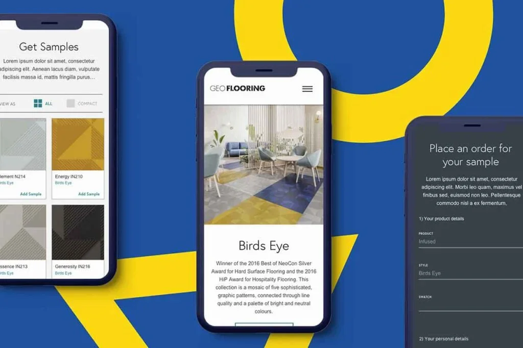
With the agency Salted Stone, I designed the UX and UI for GEO Flooring's new website, making it easy to explore, compare and order samples of commercial flooring.
GEO Flooring is an Australian family-owned company supplying quality flooring for commercial spaces: corporate offices, learning and research environments, health and senior living facilities, and retail and hospitality spaces.
Impact
- Information architecture built around how people choose flooring
- A sample-ordering flow on every product
- A responsive design across desktop, tablet and mobile
Challenge
Choosing commercial flooring is a considered decision. Visitors need to explore many flooring types, narrow them down, and picture each one in their own space before ordering samples, and the site had to make that feel easy on any device.
The Approach
On the UX side, I organised the information architecture around clear messaging, so people could explore flooring types, filter options and reach the details they needed quickly. Clear visuals and interactive tools helped them compare, decide and choose with confidence.
On the UI side, the focus was the product. Colour, texture and imagery helped visitors imagine each floor in their own space, while simple navigation and informative product details kept the experience easy to follow.
Design
Project Reflection
Outcome
The new site guides visitors through choosing flooring with easy navigation, clear product categories and informative descriptions, and works across every device, positioning GEO Flooring as a trusted name in commercial flooring.
What I learned
For a considered purchase, the best interface lets the product lead: strong imagery and clear categories did more for confident decisions than any extra feature.
Have a project in mind?
Let's discuss how my design system, accessibility and product strategy skills can help your team.