Battered Brilliance
A campaign page that builds trust before it asks for the sale
5 min read
View the redesign concept (opens in a new tab)
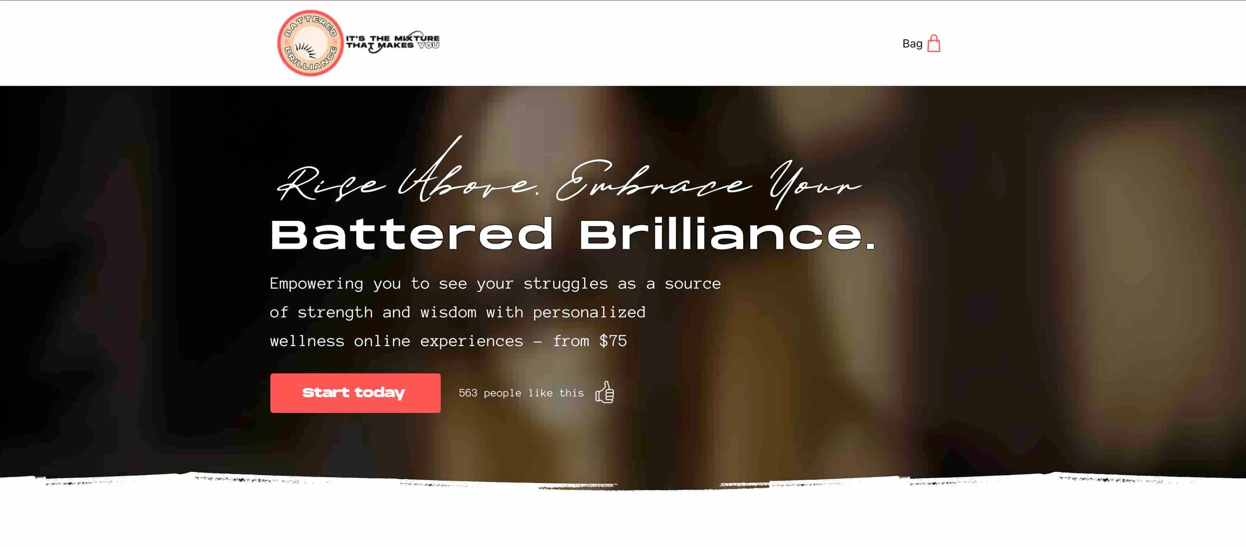
I built this concept as a UI design test for a freelance role with an organisation. It shows how the audit findings translate into a working interface, but it isn't live: Battered Brilliance's own site is unchanged. As a campaign page, it deliberately leaves out the main navigation; the logo in the header links to the full site instead.
- Role
- UX/UI & CX Reviewer, then Designer for the concept rebuild
- Tools
- Slide deck audit, Wix Studio (build), Wix Bookings/Payments (checkout flow)
- Project type
- UX Research · CX Audit → Concept Redesign (freelance UI design test, not live)
Overview
I audited a wellness brand's website across CX, UX, UI and accessibility, then rebuilt it as a concept on Wix, leading with the founder's credentials, offering three clearly priced ways to buy, and giving every offer the same booking flow.
Battered Brilliance is the wellness brand of chef and speaker Hollis Wilder, offering live virtual sessions built around her own experience with a bipolar diagnosis. The brand's value is personal and credible, but on the original site that value wasn't reaching the customer.
Impact
- 36 slide audit covering CX, UX, UI and accessibility
- 30+ recommendations mapped to specific site sections
- 3 pricing tiers rebuilt for transparency: bundle, multi-pack, single session
Challenge
Battered Brilliance sells trust as much as it sells a service. Customers are being asked to book a private, personal wellness session with a stranger, based almost entirely on what the website tells them. If the site can't quickly answer is this safe, is this worth it, and is this person qualified?, most visitors will leave before they ever see the offer.
Reviewing the live site against those questions surfaced four connected problems, detailed under What I found.
Limitations
I wasn't able to change Battered Brilliance's brand styling, including the styling of its calls to action and its font choices. The rebuild works within the existing brand, so its improvements come from structure, content, language and hierarchy rather than a visual restyle.
Researching the problem space
I worked in two phases:
- CX and UX audit. I worked through the site testing whether it answered the who, what, when, where, why and how of each offer, in the order a first-time visitor would actually need them. I mapped the current information architecture, tested every call-to-action and its destination, and reviewed the site against WCAG 2.2 AA and core usability heuristics (control, consistency, comfortability and cognitive load), mapping every finding to a specific section of the site.
- Concept rebuild. I translated the highest-impact findings into a working site on Wix, prioritising the fixes most likely to affect a first-time visitor's decision to book.
What I found
Customers couldn't tell who the offer was for, or from whom
The original site didn't lead with Hollis Wilder's story or credentials, despite her personal history with a bipolar diagnosis being the brand's core differentiator and trust driver.
The navigation used ambiguous, insider language
Menu items like “Offerings,” “Collabs,” and “Press” tested poorly against how a first-time visitor actually thinks. “Offerings” risked reading as cult-like or charitable rather than commercial; “Collabs” read as too casual for the wellness-therapy category; “Press” could be misread as the physical action rather than the media term.
Pricing and packaging weren't legible
Customers had no clear way to compare a single session against a multi-session commitment, or to see what a bundle actually saved them versus buying sessions individually.
Calls to action lacked hierarchy, and some links were broken
The original site mixed hero, cart, and content CTAs without a consistent pattern for when to use “Get Started” versus “Buy Now” versus “Reserve Your Spot,” and I found broken links across the site that needed fixing before any language recommendations would matter.
The full audit
Step through all 37 slides of the audit. The note under each slide summarises its key points.
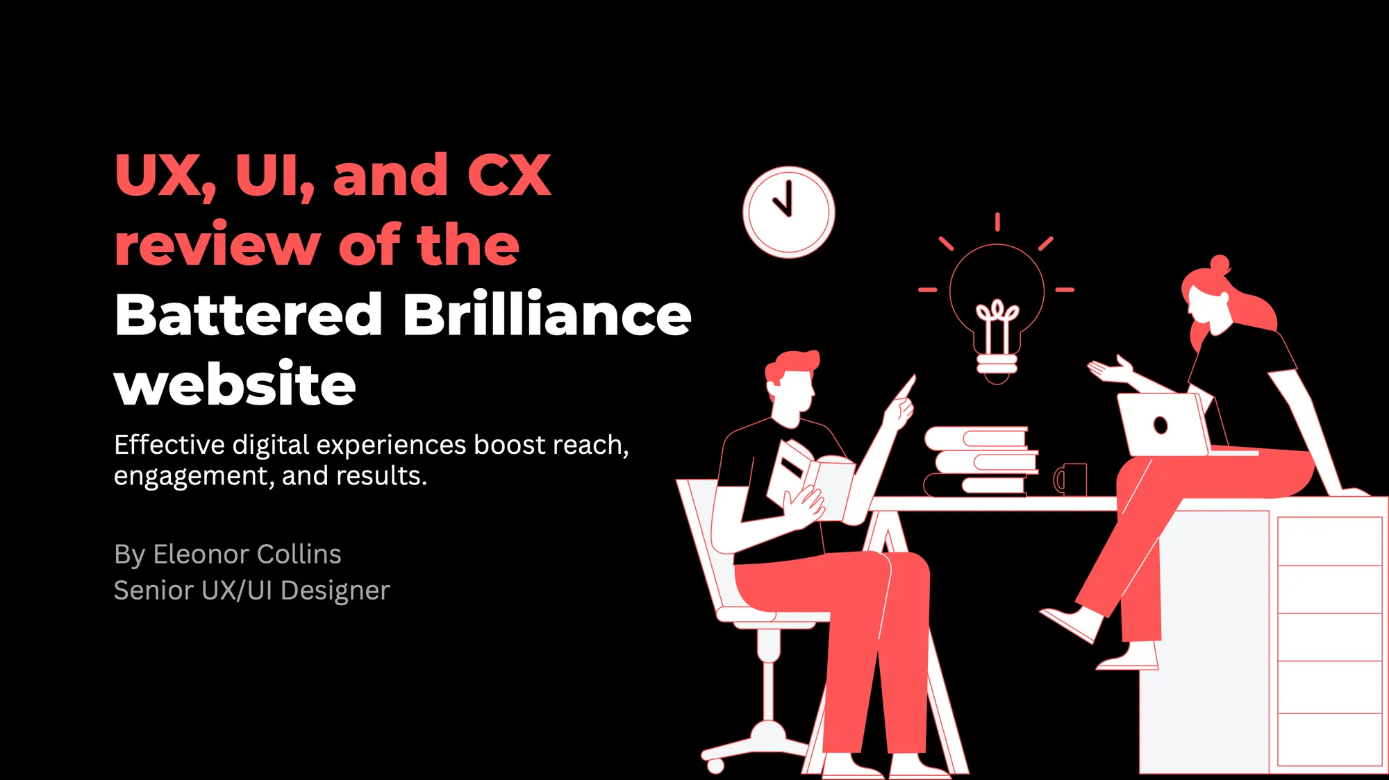
Slide 1 of 37
UX, UI and CX review of the Battered Brilliance website
The cover of the audit. Its premise: effective digital experiences boost reach, engagement and results.
The Solution
I rebuilt the site around three fixes, each tied directly back to an audit finding:
A credential-led hero and bio, above the fold
The homepage now opens with Hollis Wilder's story and background (award-winning chef, wellness innovator, and her own experience overcoming a bipolar diagnosis) in a dedicated “Meet Hollis Wilder / Your wellness guide” section near the top, rather than buried or omitted.
A three-tier, transparent pricing structure
Every offer now sits in one of three clear tiers, each with the saving spelled out in dollars rather than left for the customer to calculate:
- All-in-One Wellness Starter Kit: a 3-session bundle (meditation, vision boarding, mindful cooking) at $250, marked against its $323 combined value
- Flexible Meditation Multi-Packs: a 3-pack ($200, save $25) and a 5-pack ($300, save $75) for customers building a regular practice
- Single Wellness Sessions: book-anytime individual sessions from $75, for customers who want to try one experience first
A consistent, action-oriented CTA and booking pattern
Every offer now uses the same predictable pattern: “Buy Now” for packs and bundles, “Book Now” straight into a live Wix booking calendar for single sessions. That removes the inconsistency and broken links flagged in the audit.
All-in-One Wellness Starter Kit
Flexible Meditation Multi-Packs
Single Wellness Sessions
Project Reflection
Outcome
The concept turns the audit into a clickable demonstration: a homepage that leads with trust before it asks for a sale, and pricing a customer can compare and act on without needing to ask a question first.
What's still open
The testimonials and FAQ sections are currently placeholder content carried over from the Wix template. They're structurally in place (a testimonial carousel and a collapsible FAQ block sit exactly where the original audit recommended them), but need real client testimonials and real Battered Brilliance FAQ content before this could go live. That's the natural next phase: the audit itself ranked “answers to common questions” and “success stories from real customers” among the highest-priority trust gaps.
Have a project in mind?
Let's discuss how my design system, accessibility and product strategy skills can help your team.